
Contents
What if you could read the minds of your government website’s visitors? Understand what they’re looking for, how they’re looking for it—maybe even how they feel about it.
You could get them the information they need faster, reduce frustrating phone calls, and even build trust in your agency.
You can get a little window into your users’ head with Google Analytics.
Google Analytics is a free web analytics service that tracks and reports on your website traffic. You can gain insights into their needs and preferences by collecting data on how users interact with your site—such as which pages they visit, how long they stay, and what paths they follow. By exploring how users interact with your site, you can begin to visualize their needs.
While there’s a lot to learn in Google Analytics, getting started with a few basic reports isn’t as hard as you might think.
In this blog post, we’ll walk you through using Google Analytics to pinpoint what works and what doesn’t in your website’s current navigation, step-by-step. We’ll include examples from our clients’ Google Analytics as models that you can use to help you analyze your data!
Why Do I Need Google Analytics for My Government Website?
For government websites, Google Analytics helps ensure that your site effectively meets the public’s needs. By analyzing user behavior, you can identify which parts of your website are performing well and which areas might be causing confusion or difficulties. This allows you to make informed decisions about how to structure your navigation menu and organize content so that citizens can easily find the necessary information or services.
How Do I Access Google Analytics for My Government Website?
We often speak with people new to managing their organization’s website and unsure where to get started with Google Analytics. If you haven’t set up Google Analytics on your website, use this Google guide to get started. If you feel like you’re over your head, you can hire a consultant. Also note that in mid-2023, you should have migrated your data to Google Analytics 4 (GA4). If you didn’t, you may have data missing.
Most Visited Pages
Now that you’ve logged into your GA4 account, let’s start with an easy win: What pages on your site get the most traffic?
To find out, click on Reports > Engagement > Pages and screens.

Make sure these high-interest pages are easy to get to on your navigation menu.
One caveat here: If a page is frequently visited but has a high bounce rate, that indicates that people aren’t finding what they expected on that page. Change its label to something more descriptive. And consider what services or information users might have been seeking and how you can make it more visible.
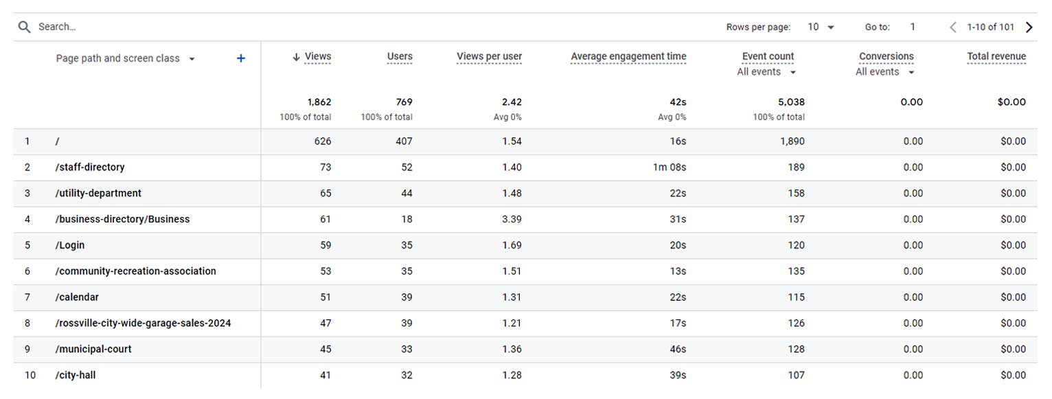
Least Visited Pages
To sort by which pages have been viewed the least, click the down arrow next to “Views” on the “Pages and Screens” report. This will sort the pages with the least viewed at the top.
There could be two causes for a page not getting much or any traffic:
1) It’s too hard to find. Maybe it’s buried six clicks deep, so users don’t even know it’s something they can access.
2) It’s genuinely not something users are looking for. We sometimes have clients tell us they want to prominently feature a particular page because they think it’s important to users. However, if there’s a highly visible link, but no one clicks on it… The data shows that it’s not that important.
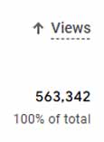
Path Exploration
This is perhaps the most useful tool in evaluating your current navigation structure, as it shows how users interact with your navigation menu. Orbit Media gives a good breakdown of how to access your path exploration and insights you might discover from it:
Here are thoughts you might have and actions you might take:
“Whoa, 20% of our visitors are looking for a job!”
…then you make a segment or filter to exclude those visitors while analyzing lead generation marketing.
“Wow, people want to see our team members.”
…then you polish up those bios and start featuring your talent on your homepage.
“Hey, no one cares about our industry pages.”
…then you turn that section into ‘case studies’ and rework the content accordingly.
The basic idea is to remove things that rarely get clicked if they aren’t important, rename them if they aren’t important, or move things around to help visitors get where they’re trying to go.
Let’s look at this county’s path data for a government-specific example. In the 28 days we pulled this data, 224 people clicked on “Human Resources.” But then 97 of those people went back to the County’s homepage. But from there, 42 went back to the Human Resources page! It’s clear that whatever people are looking for when they click Human Resources… They aren’t finding it quickly.
What could this county do to improve the user experience in this case?
Crazy Egg allows you to put surveys on either open-ended or multiple-choice pages. They could add a question on the Human Resources page that asks, “Did you find what you needed on this page?” If the user selects “No,” they could receive an open-ended question, “What information were you looking for?” with an option to leave their email address so the county can follow up with them.
Google Search
If you have pages often accessed by Google search, that may be a sign that they’re difficult to find on your website navigation. To understand why, suppose you’re a Town of Smithville resident and need to pay your water bill. You go to the Smithville website first but can’t figure out how to do it. You go back to Google and search “Pay Smithville water bill.” That leads you to the Smithville water department. Maybe the Town of Smithville needs a button that says “Pay My Water Bill” rather than making users click on “Utilities,” then “Water Department,” and then “Pay My Water Bill.”
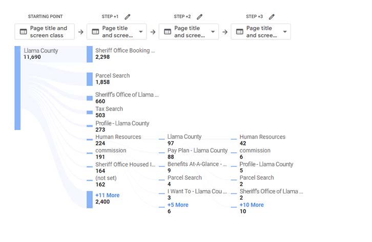
Seasonal Variations in Google Analytics Data
Information about snowplows, lawn waste collection, voter registration, etc., are naturally more important to residents at some times than at others. To be sure you’re accounting for these variations, look at one or two years’ worth of data and see where there are anomalies. You may want to add high-visibility buttons to your site at certain times of the year to correspond with your residents’ seasonal needs.
Note the spike in visits to the Rossville, Kansas, “Tall Corn Festival” page in August:
Visitor Demographics
Take a look at your visitors’:
- Location
- Language
- Age
- Gender
- Interests
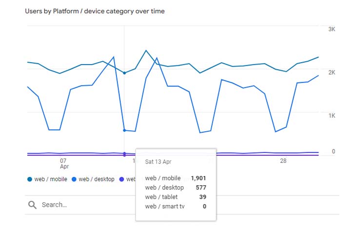
Device Types
What platform or device type your visitors are using may impact how you design their navigation. From the clients’ data that we reviewed, users were almost evenly split between desktop and mobile, with around 1% using tablets or smart TVs.
However, desktop use drops sharply on weekends, particularly for our county government clients. This suggests that many people use desktops to access the website for work purposes, such as when a contractor is applying for a building permit. But residents on the site for personal use are more likely to be on mobile devices. See whether this trend holds true for your website.
So, What Now?
Armed with this knowledge about your audience’s behavior, you’re ready to design your navigation menu! Get our e-book, “User-Friendly Government Website Navigation: The Ultimate Guide” for practical tips on:
- The fundamentals of user-centric design
- Using data to understand your user
- Types of government website navigation menus
- Demographic considerations in setting up your navigation